For my third assignment, I had to be conscious of how light sources effected my subjects. I think more than anything, these assignments are making me think about the pictures I take instead of just taking tons of pictures of the kids. I showed my "top five" in class yesterday. It went better than the first time. I'm "progressing." His big issue with my photographs is that I "zoom" in too much. I don't capture what's around my subjects, so its not as interesting. I didn't fully get it, but I came home and looked at a bunch of the pictures from an outsiders point of view (as much as I could), and I can see what he's talking about. I guess I've been wanting to capture moments in my kids' lives, and doing it up close is the best way in my opinion! I also took some pictures of Roby working on his motorcycle in the garage that evening because the kids were watching him. I tried various things with getting closer in, getting more of the background, etc. And honestly, although I wouldn't be proud of showing the entire class the mess that is our garage, they are "better" photographs. I'll try to post a few of them here or on REEN sometime soon...too much going on right now though. So...here are the five I showed in class:
I took this one a while ago, but it fit the assignment, and I couldn't make it back to the zoo to try to duplicate it or get a better shot.

This isn't the best composition, but I liked how the light was shining on the controller and he is in shadows...making the controller the most "important" thing in the photo. (I tried to go back and get his whole hands a pic, but by then the sun had shifted enough that it wouldn't work.)

I like how she's all in shadows which matches her glum posture and expression. He did like that too, but said it was composed awkwardly. That it seemed forced and needed more of the playground and background in it.

This was one of my favorite pictures. I loved the shadows and how the girls' hands are overlapping on the dogs back. I also like how Natalie and the dog are looking up at the man that you can't see all of. But again, it is too zoomed in, and getting this moment with more surrounding "stuff" would make it a better photograph.

When I came home I found this (and a few more) that I think he would have liked more. I suppose it is more interesting...I still like the first one more... ;-)

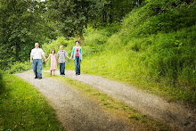
He did like this one!!! Woo Hoo!!! I love how soft it is, and its not too close!!! (Good thing I didn't choose the one that was closer!)

My next assignment is a Power Point presentation on a photographer. That should be interesting. Just minutes ago I turned in my second assignment in digital photography. I'll post about those later. I'm trying to get as much done this week (in all my classes) as possible as we have a lot going on next week with Ethan's birthday!!!
2 comments:
I love the last Ethan photo best of all...so who is the photographer you are studying? Because Im a smart ass I would have chosen someone who photographs nudes...cause I rock like that.
The globe shot is definitely the best! Perfect composition.
I don't think the one with the girls w/the dog is so bad - maybe if the girls were not in the center of the image... but, seriously! the one that is zoomed out doesn't really tell the story to me, b/c you can't see the girls' faces. Then again, I'm all about the faces, and your class is more about "art" not portraits. So just know that all of this is very subjective, and he's trying to get you to "see" in a specific way (telling stories) - but there are many ways to "see". He seems to be from the Annie Liebovitz school of portraits (get the story around the subject), which is awesome. But there's more than one way. So... cool... you're learning awesome stuff. The next professor will probably see differently and you'll have to change again! haha that's just the way it is. Art is soooo subjective. You're doing great!
Post a Comment