My pictures aren't due until Wednesday, but I'm probably going to turn them in tomorrow just so I won't have to go in super early or wait in line for 30 minutes to use one of the four computers everyone will be trying to use right before class. I have narrowed my massive amounts of pics down to 45, and from that have 10 that I'm debating on which ones to share. Its hard to look at these pictures abstractly, especially because I love the expressions and whatnot my kids make. I pretty much know three of the five I'll be sharing, but the other two...well...I guess I have this evening and tomorrow morning to figure that out! Remember, I'm still learning to take more than snapshots...so...they aren't brilliant photographs!
I like this as I love her expression. Her body weighs down the right side of the picture, adding some contrast to the white and brown...but I doubt I'll use it.

I like the movement of this one, the eyes and bodies all go to the right. The door either gives it interest or makes it not work...I don't know which. Probably won't use this either.

I like the movement and the shadow in this, but most likely wont use it either.

Here is where it gets a little harder for me to decide.
I really like this one. But if I would have stood up, I think the composition would have been better. There is too much empty space at the bottom of the picture. Damn, would have been perfect to show if I would have just taken it from a foot or two higher.

I love this one. How her body takes up the upper part, the shadow takes up the middle, and the white snow at the bottom. I also like the curves and movement of it as a whole.

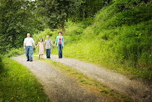
I love this one also. I like the bland colors and lines of the trees, with the bird houses giving it a little bit of interest. I like the curve of the path, and the movements of the two girls feet as well as Ethan standing in the opposite direction. Oh, and the shadows are kinda cool too.

I really love this picture, but I don't think it truly fits the assignment. If I would have gotten the paper in it too, not been quite so close, I think it would have been better.

I am going to use this one.
I like the curve of the hat, his mouth, and the book. The horizontal lines of the window, book, and arm. The darkness of him stands out against the light from the window.

I am using this one as well.
I like the curve the three buckets make. It seems to draw they eye around the picture well. And the bucket at the upper left corner gives it a little balance I think.

For some reason this last one is still my favorite, so I'll be showing it for sure.

In ways, I wish the assignments were in black and white, but I'll get to that someday I'm sure. I'm taking lots of pictures. Most suck...but I guess thats the point of taking a class! Learning what works and what doesnt!
2 comments:
I love the 1st one. I know you said you werent sure if you would use it but...... for some reason your daughter looks like a GIANT to me in this picture. Im not sure that makes it an abstract way of looking at it, but proportions aeem outta whack some how..... and also, the one of your son with the book is wonderful. The curve of the pages near the binding are also reflected in his hat.
you have a true and growing talent. Keep up the good work. :-)
Im a huge fan of the tree pictures. I love the path and bird houses and of course I absolutely love the last one. Im facinated by trees a the moment I guess. Good luck chica!
Post a Comment